


Blog
Posted on June 24, 2015 by MyNetWire
Categories:
Website Design
Small businesses in the United States -- and especially in Indianapolis -- should be aware that web design and development has never been more important in supporting a business. Indianapolis web design promotes the products and services that make the city and its people great. Considering that practically everything related to business can be found online nowadays, it’s vital for businesses large and small to create and maintain a website that promotes its brand, highlights its products and services, and perhaps most importantly gives customers information on how to purchase them.
Web design leaves very little to chance, and it takes a professional web designer to build a site that best represents a company’s brand, what it does and why it does it. It goes without saying, though, that because small businesses often lack the resources to either build a website themselves or know what to look for when outsourcing the job, they can fall into pit traps and make mistakes that defeat the whole purpose of having a website. Having a website in itself isn’t enough. Anyone can make a website for free (or for practically nothing) nowadays, but an effective website -- that’s a different story.
In order for your Indianapolis business to avoid this fate, here are nine guidelines (many of which were suggested by the good folks at Forbes) to follow when building a website:
- Hit the Target...Audience: Finding your target audience is nothing new. In fact, it’s considered one of the basic tenets of business. You wouldn’t waste much time marketing dentures, for example, to teenagers! In the same token, website designs first and foremost must determine what kind of customers it needs to cater to.
With websites, target audiences can be tricky. Not only must the actual products and services be taken into account, the kind of online user must be taken into account also. For example, if your business sells a product meant for younger people, the website should be compatible with mobile devices such as a smartphone considering the younger generation, on average, uses them more than older demographics. At the same time, a website that mostly caters to older people may want to feature larger fonts and a simpler layout.
- Quality Over Quantity: Expanding on the need to create mobile-friendly websites, especially for a younger, more tech-savvy demographic, it’s important to launch a design that is stylish but succinct. That is, it should avoid stuffing a website with too many graphics, videos, plug-ins, and other website design features that can disrupt loading time and, in general, make things confusing. On a more casual note, users can tell if a website is “trying too hard” to make itself attractive, which can be a turn-off.
Keep in mind that most users have an objective in mind when they go on your website. On average, if they can’t access what they want within three seconds, they will move on to another website.
- Take Charge: It’s important to create a layout that takes command of what the user should do. Have a clear objective in mind. Should the user, for example, buy products directly on the website or go to the business itself? Should the user contact the business for more information or should they have the option of receiving the company newsletter? The more direct a website is in terms of what it wants its users to do next, the more likely a user will pay attention.
What does this entail, exactly? Well, for starters, every webpage on the site should lead to something else. The “About Us” section for example, a section that most business websites have, should direct users to the bios of company heads, including (if they’re willing) to C.V.’s and/or personal website. If a user is trying to find out the details of a business’s products and services, the website should have a clearly-labeled section with that information. Links to purchasing sites and venues is also a good idea.
Long story short, there’s no such thing as a web design element that’s left to chance.
- Create a Budget and Stick With It: A common reason why a website fails is that the company devotes too little of its budget -- or too much -- to website design. Interface, photos, domain names, hosting, visitor tracking, troubleshooting -- it all costs money! There are a number of suggestions and theories about how to go about spending for website design. In general, small companies should spend anywhere from $6,000 to $20,000 on their websites, at least according to the blog Executionists. In terms of allocating that money, the breakdown should look something like this:
15% Planning
25% Interface Design
40% Programming
20% Project Management
Executionists also recommend that once the website is completed, companies should devote at least $250 a month for its maintenance. A phenomenal website design comes next to nothing if something is broken, just like an amusement park is worthless if the roller coasters don’t work!
In addition, companies should do research into website design companies to figure out who they best cater to. That is, do they work primarily with small businesses or do they take on big-name clients? A small company that employs the latter may find itself at odds with their designers, who probably aren’t used to Main Street businesses.
- Keep Up With the Times: This point goes along with what was mentioned above, that proper maintenance is critical to the success of a website. Have you ever noticed websites that haven’t been updated in years? Most websites publish when they were last updated somewhere on the homepage. If you’re on a website that was last updated in 2013, for example, you’re probably a little hesitant to trust it. After all, if a business doesn’t bother to check its website every now and again, how reliable can its products and services be? Not to mention the fact that some users might think a company has gone out of business!
Now that information is constantly available, 24 hours a day/seven days a week, keeping your website updated is a given. Not only do users notice updates, so does the competition. Maintenance also has much to do with the competition and not just the users. If your competition’s website features the latest in web design and development, they’re more likely to gain more users. “Keeping Up With the Joneses” has always been a cornerstone in business. In web design, it’s no different.
- Be Inclusive...But Not Too Inclusive: Touching on tip #1, a website needs to have a target audience in mind but, on the other hand, it shouldn’t exclude a user simply because he or she is not part of the targeted demographic. These users are still interested in the products and services; otherwise, they would not even be on it. It may be that they’re looking on behalf of someone, such as when they’re searching for a gift or helping a friend out. Therefore, a website design should accommodate them as they would with the target demographic.
However, the trap many websites fall into is trying to be too inclusive; that is, trying to appeal to everyone. Target demographics are there for a reason. If your business sells high quality meat, for example, the website shouldn’t necessarily cater to the tastes of, say, vegetarians. In general, it’s a well-meaning but ultimately ineffective idea to -- well, be too general! The devil is in the details, as the saying goes, so don’t try to be an angel.
- Don’t Go It Alone: For some things, DIY (or “do it yourself”) just doesn’t pan out. We can’t do everything by ourselves. If we could, there would be no such things as professions! In the world of web design, DIY can be especially treacherous. Designing a website takes a set of skills as well as considerable patience. Some companies decide that they can do it by themselves, relying on Google and other sources to get them on their way.
Needless to say, this approach typically doesn’t end well. If anything, first impressions matter a lot to users. Impressing a user in the first three seconds takes a considerable amount of work, planning, and insight -- something people with little-to-no design experience are simply at a loss for. It’s hard enough for a professional, let alone a neophyte in the designing world.
Do your company a favor and hire a web design company or at least an in-house web designer. You won’t have trouble finding one. Web design is one of the hottest and fastest growing industries in the U.S. You wouldn’t leave your product designs in the hands of amateurs, so why leave your website to them?
- It’s the Economy (of Language), Stupid: Your website design -- the best online representation of your company’s image and brand, of its products and its employees -- depends on something that is rather old-school: the written word. George Lucas once said that “a special effect without a story is a pretty boring thing.” In the same vein, a website design, however stylish or impressive, is meaningless without content that backs its up. Users can see right through a website that’s all glitz and glamour and no substance. An attractive layout won’t make up for confusing, vague, or flatout false content. Good writing, much like a good story, is everything.
For this, be sure to have someone copy edit the website’s content. This doesn’t exactly fall under the domain of web designers; content writers, editors, and advertisers are much better suited for the job. Better yet, have them write the content themselves! This may cost you more in the short-term but then again, you can’t design your way out of poor writing and bad grammar! Spelling errors and grammar mistakes are inexcusable. They make your website look bad and will more often than not drive away users.
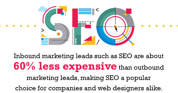
- Gentlemen, Start Your Search Engines!: Last but not least, your company website should be designed with search engines in mind. What does this mean? It means that the website’s design and content should revolve around what search engines such as Google, Bing, and Yahoo! look for when conducting searches. In a method that’s known as “search engine optimization” (SEO), websites include these design features with the hopes that it will appear first or as close to it as possible on relevant search results pages. That means websites feature certain keywords, for example, or are written in codes that make it easier for search engines to find relevant links within a webpage.
Consider this. Let’s say that your company sells oranges. Under a good SEO campaign, the website would feature keywords such as “orange groves,” “orange juice,” “orange distributors,” “citrus fruit,” etc. -- words that users are most likely to type in when making a Google search. The better the keywords, the more traffic it will get.
In addition to the content, the design part is just as critical. If this website has pictures of oranges (naturally), then designers should embed the image with code that tells search engines what exactly the photo is. The better the design, the more attention it will get.
Of all the facts regarding search engines, this one is probably enough to get any business interested in SEO: more than 93% of all sessions on the Internet begin on a search engine. Ninety-three percent. Considering that there are more than three billion Internet users in the world today, that figure is mindboggling! Think of all the users you can reach simply by employing SEO.
These nine tips should get you well on your way to building a company website that is clean, clear, professional, and most importantly, effective. For better or for worse, no company can escape the wide embrace of the Internet. The World Wide Web is here to stay, and companies that don’t keep up with the times risk falling behind. By following these tips, your company can impress and draw customers nearly everywhere on Earth, let alone Indianapolis.
Posted on June 16, 2015 by MyNetWire
Categories:
Website Design
It is no secret that companies that take a structured approach toward conversion optimization for their websites are twice as likely to see a significant increase in sales than companies that do not. The purpose of website conversion is simple. As the name suggests, website conversion methods convert website visitors into customers. Website conversion takes a lot of planning, skill, and hard work but when all's said and done, the results can be extraordinary.
There is no reason why companies should not at least consider some of the basic tenets of website conversion. In fact, these techniques aren't a luxury reserved for large companies with an army of web designers under their payroll. They are meant for companies of all shapes and sizes (although smaller companies tend to hire independent companies for their web designing needs). Website conversion can be the difference between maintaining the status quo and taking your company to newer, greater heights.
To better illustrate how this strategy can work for you and your business, here are 10 website conversion tricks that are sure to turn visitors to users and users to paying customers:
- It's the Subtlety That Counts -- Web conversion involves a quite a bit of behavioral psychology. How people think. How they make decisions. How they are influenced by what's around them and how they influence other people. The field of behavioral psychology is quite massive -- far too much to include in one post. However, there are a few basic concepts that business owners and marketers should keep in mind when designing website conversion strategies. One of them is this: the Law of Past Experience (also known as the concept of 'Mental Models'), which is the belief that past experiences directly influence current experiences.
-
The concept itself is a bit broad. After all, most of psychology can be divided into two camps: one that states that experience alone influences thinking and development, and one that holds that thinking and development are ultimately internal. Still, the Law of Past Experience has been proven true in many studies. A 2008 study, for example, found that children who were shown a Santa Claus cap were more likely to share candy with other children than those who did not see the cap. Why? Because at a young age, many children are taught that Santa Claus represents gift-giving and goodwill. The children associated the cap with sharing and, as a result, shared their candy with the children around them.
This concept is definitely applicable to (much older) Internet users. Website conversion often relies on images, videos, and designs that specifically evoke a message or feeling that best represents the company. A business that sells health care products, for example, should choose images that evoke the concept of healing and growth. Including images just for the sake of it does little to attract customers. In fact, meaningless images may do more harm than good. After all, how naive do you think Internet users are? Stock images flood the Internet. Users want something more when they are looking for a product to buy or a company to do business with.
-
Freedom of Choice Can Be a Bad Thing -- One area of behavior psychology, a topic covered by everyone from Aristotle to B.F. Skinner, is the idea of 'freedom of choice'. That is, are we really free in choosing what we do or think, or are there psychological factors that bind us? There is no easy answer -- there are no easy answers in psychology -- but some in the field notice that being presented with too many choices can be as detrimental as being presented with not enough. The 'Paradox of Choice', a concept coined by preeminent psychologist Barry Schwatz, argues that the more choices a consumer has, the less likely he or she will actually pick one. Having too many choices can lead to fears of buyer's remorse, anxiety, and confusion.
'Choice paralysis' can be overcomed in website conversion by limiting the choices offered as well as suggesting what to choose. Highlighting a certain product or service in a group, for example, can lead to more conversions and, consequently, sales.
-
If You Got It, Flaunt It -- This may seem obvious, but showing your actual product or service will lead to more sales. Amazingly, there are quite a few websites that don't bother displaying images of what they sell or offer. A company that sells plumbing supplies, for example, should features images (detailed images, not stock ones) of pipes, wrenches, filters, and other supplies. Just like customers in a grocery store want to actually see or feel the food they are buying, online customers want to get a sense, a visual sense, of what they might purchase.
For software companies, including an image of what the application looks like is incredibly important. Buying a user interface is a big decision for small businesses. If they don't like the appearance, even if the interface itself is top-notch, they are less likely to buy it. The 'aesthetic-usability effect', for better or worse, is paramount in business and website conversion.
-
Samples, Please -- The best ice cream shops are those that give out samples. No one wants to be stuck with an ice cream flavor they don't like. It's remarkably similar in business, especially when dealing with thousands of dollars! When dealing with such sophisticated, expensive products and services, customers want to be sure they are choosing the right one. One way to get those website conversions up and running is by offering samples of your services. The more time a customer spends working with a sample, the more likely he or she will choose it (again, direct experience).
'Freemium' service, for example, is a business model in which a company offers a limited service for free. It is not a trial; the customer has the option of using the freemium service indefinitely. Many music streaming companies such as Spotify and Pandora, for example, offer freemium services with great success. The idea behind it is simple: draw customers in, have them use the product, and if your product is good enough, customers will more than likely choose the full, paid services. And if they don't, it might be time to retool the services they used.
-
AIDA (Attention, Interest, Desire and Action) -- It may not the most pleasant-sounding of acronyms but it is quite important for web conversion and, for that matter, marketing. The concept is simple enough. Attention refers to initially drawing a customer in; interest means getting that customer genuinely interested ('intrigued' might be a better word) in the product or service; desire takes interest a step further in that it makes the customer feel he or she will benefit from choosing the service; and action is the final step of making the customer buy the product.
Of course, going about designing an AIDA strategy is easier said (and written) than done. The last two steps, desire and action, are particularly challenging. Having a customer feel desire for a product, so much so that he or she will act on it, is the ultimate goal of any website conversion strategy. One way to go about building desire is to highlight the benefits of the product or services. How will this product benefit me? Answer that for the customer and you are well on your way. Making a customer act on a product is tricky but in general, offering limited time offers, stressing the limited stock or availability, and otherwise emphasizing urgency tends to work. In addition, make sure that customers who want to buy the product can do so immediately. Have a link that will lead them to a purchasing page, or a call-to-action such as 'Contact us today'.
- Lead the Way -- The AIDA strategy will go much smoother if you take the extra step in guiding potential customers through a website. Rather than just plopping text and images on a website, you should structure your website in a way that will have the user focus on particular components. Use images to 'guide' the eyes. An arrow, for example, almost always leads users to a link or image at the end of it. The website, in general, should 'flow', having the users follow a path with all the important aspects of the business visible along the way. At the end, it is always advisable to include a signup or download link. Every journey, after all, should have an end.
-
Know Your ABCs -- In business, 'ABC' refers to the idea of 'always be closing'. That is, every step in the web designing process should always have, either directly or indirectly, the intent of locking in a new customer. The best way to follow the ABC principle is to make the website as clear as possible. Have easy to use tabs and links that will allow a user to find out everything they would want to know about a product or service. And once they are ready to sign up, be sure the website has a clear section for the user to do so.
Also, avoid dead ends at all cost! Dead ends -- pages that do not lead to somewhere else or even suggest somewhere else on the website -- can deter a potential customer pretty quickly.
- The Gutenberg Rule -- The 'Gutenberg Rule' is a psychological (as well as linguistic and optical) concept that establishes how people read. In the Western world, it is quite simple: left to right, top to bottom. The Gutenberg Diagram slips up Western reading habits into four quadrants: the 'Primary Optical Area' in top left, the 'Strong Fallow Area' in top right, the 'Weak Fallow Area' in the bottom left and a 'Terminal Area' in bottom right. The diagram indicates [NOTE: include Gutenberg Diagram] that at least in the Western world, the top left and the bottom right are the most read portions of any kind of textual layout. Especially considering that Internet users tend to skim pages, the best website conversion methods put a company's most important information in the Primary Optical Area and the Terminal Area. Putting a link to a signup page in the Terminal Area, for example, will draw a user's attention much effectively than putting it in the bottom left hand or upper right hand corner.
- Test, Test, Test -- Testing your website's strengths in viewership, traffic, compatibility, and search engine visibility is essential for any website conversion campaign. There are plenty of tools online that can help businesses track how many clicks their websites get, how long users stay on them, how often their websites come up on search engine results pages, and other vital statistics needed to stay ahead. Google Analytics, for example, is a free service that companies of all shapes and sizes can use.
- A Title By Any Other Name -- Finally, when all is said in done, it is important to create the right kind of titles for your website. Writing catchy, memorable, and moreover direct titles will be sure to catch the attention of a user. Chances are, a user will not read through or even click on a website with a generic, boring title. Website conversion relies on grabbing the user's attention immediately.
By implementing these ten steps, your website will be well on its way to getting the web conversion your business needs -- and deserves. Businesses of all kinds rely on the Internet for many of its marketing functions. In order to ensure your business will not be left behind, website conversion should be a major priority.
For more information about website conversion, feel free to contact us.
Posted on June 9, 2015 by MyNetWire
Categories:
Website Design
Many people are wondering just exactly what is the significance of Mobilegeddon and what potential issue will be resolved with this change. In an effort to provide mobile users a better search experience, Google implemented a mobile-friendly update on April 21, 2015 to get more accurate and relevant search results.
Mobilegeddon is a ranking algorithm that is meant to boost web pages that are mobile-friendly when a Google search is performed from a mobile device.
Mobilegeddon is a ranking algorithm that is meant to boost web pages that are mobile-friendly when a Google search is performed from a mobile device.
Basically, does your website's design have the ability of fitting to a smaller screen while keeping the visitor on the same version of the website? Many websites force visitors to a different website design or offer a limited version for mobile visitors, thus sacrificing quality and the overall experience.
Mobilegeddon Explained - The New Website Design Standard
Traditionally, a majority of websites were mainly viewed from desktops or laptops but the new age of smartphones has greatly shifted what users are choosing to view the internet today. More than 50% of internet traffic is from mobile devices, which has prompted search engines to adjust their algorithms to deliver more visitors to websites that comply with this design standard.
Some websites that weren’t ready for this update haven’t noticed any setback yet, but Google will keep making smartphone users a priority as long as data supports this trend. This trend is not likely to slow down as Google wouldn’t go through the trouble of updating an algorithm if there wasn’t some incentive involved so keep that in mind.
Is your Indiana Website's Design Prepared For This Update?
The movement towards mobile users reaching for their smartphone to access the internet could eventually lead to an algorithm tweak. Those websites that don’t comply could face a hit in the search results.
Most websites that lack being mobile-friendly are due to the following:
Most websites that lack being mobile-friendly are due to the following:
- Text too small to read
- Links placed too close together
- Mobile viewports not set correctly
Recent Posts
- Cost Cutting Measures To Reduce Business Expenses Without Losing Any Of Your Staff
- Essential Tips That Ensure Your Small Business Has Productive Online Meetings
- What Are The Best Practices For Working Remotely In Business?
- A Useful Guide To Navigate Any Small Business Through A Crisis
- 4 Ways To Receive Good Customer Reviews
Archives
-
2022
- December 2022 (3)
- November 2022 (7)
- October 2022 (8)
- September 2022 (5)
-
2021
- March 2021 (1)
- January 2021 (1)
-
2020
- November 2020 (1)
- October 2020 (1)
- September 2020 (2)
- August 2020 (1)
- July 2020 (2)
- June 2020 (1)
- May 2020 (2)
- April 2020 (2)
- March 2020 (2)
- February 2020 (1)
- January 2020 (3)
-
2019
- December 2019 (2)
- November 2019 (2)
- October 2019 (2)
- September 2019 (3)
- August 2019 (2)
- July 2019 (3)
- June 2019 (2)
- May 2019 (3)
- April 2019 (2)
- March 2019 (3)
- February 2019 (2)
- January 2019 (3)
-
2018
- December 2018 (3)
- November 2018 (3)
- October 2018 (3)
- September 2018 (2)
- August 2018 (4)
- July 2018 (2)
- June 2018 (2)
- May 2018 (3)
- April 2018 (3)
- March 2018 (2)
- February 2018 (2)
- January 2018 (3)
-
2017
- December 2017 (2)
- November 2017 (1)
- October 2017 (3)
- September 2017 (1)
- August 2017 (2)
- July 2017 (1)
- June 2017 (2)
- May 2017 (2)
- February 2017 (1)
- January 2017 (3)
-
2016
- December 2016 (1)
- November 2016 (2)
- October 2016 (2)
- January 2016 (6)
-
2015
- December 2015 (5)
- November 2015 (1)
- October 2015 (9)
- September 2015 (3)
- August 2015 (4)
- July 2015 (2)
- June 2015 (6)
- May 2015 (5)
- April 2015 (6)
- March 2015 (2)
- February 2015 (3)
- January 2015 (2)
-
2014
- December 2014 (2)
- November 2014 (2)
- October 2014 (2)
- September 2014 (1)
-
1969
- December 1969 (4)